Significa.
A website that is our own.
Published in 2023
Recognitions

Awwwards
Distinction
Strategy
Project Management
Interface Design
User Experience Design
User Interface Design
Brand Strategy
Illustration
Front-end Development
Back-end Development
Services
Website
Brand
Deliverables
Links
Team involved
Hello. This is the inception of a website project within the website itself. This is also a website about eggs. And a website that is a faithful representation of who we are. Fun, light, full of easter eggs and gimmicks, probably one on every page, but at the same time, the subject of deep thought and thorough strategy, design, and development work.
The challenge.
As we grew over the years, we never had enough momentum to take the buildout of a new website until the end. It would die off halfway. Every single time. Naturally, it got outdated in all aspects – projects, content, tone of voice, brand, personality, culture, everything really.

Every time we'd go to our old significa.co, it just didn't feel right. It didn't picture us. It could picture any agency, though. Just not ours. Too formal, too dull, too unprovoking, entirely off-brand. We are none of this.
It literally felt like we lived in a cave somewhere in Scotland, stopped in time.

To strike the perfect balance between expressing our humorous, creative nature while showcasing the quality of our thoughtful work was (and still is) our biggest challenge. We don't want to seem too foolish or too formal. The virtue is in the middle, like Malcolm.
Off the cave, we came. Finally.
The new website.
First, perhaps more importantly, we are all proud of this website. By "we", we mean the whole team. Everyone feels this website, in its entirety, to be Significa's. Let us show you why.
Comic Sans.
We feel like we have nothing to prove. The quality of our work speaks for itself. This allows us to have the confidence to use Comic Sans. Possibly the most hated font by the design folks.

The Draw your egg.
As a team, we all have our own Segg. Well, the Segg is each of our characters drawn on top of an egg shape. You know, because our logo is an egg. We wanted anyone to be able to draw their own Segg. You can give it a shot on our careers page.
The canvas.
Putting Significa's culture into words is hard. Putting it into images is also hard. Painting a picture of everything that happens behind the scenes is impossible. Our embedded joyful demeanour, our willingness to try new things, experiment, enjoy each other's company, etcetera ... it can't be told. That's why we created the Careers canvas, so you can drag around, play games, and scratch the surface of who we are.
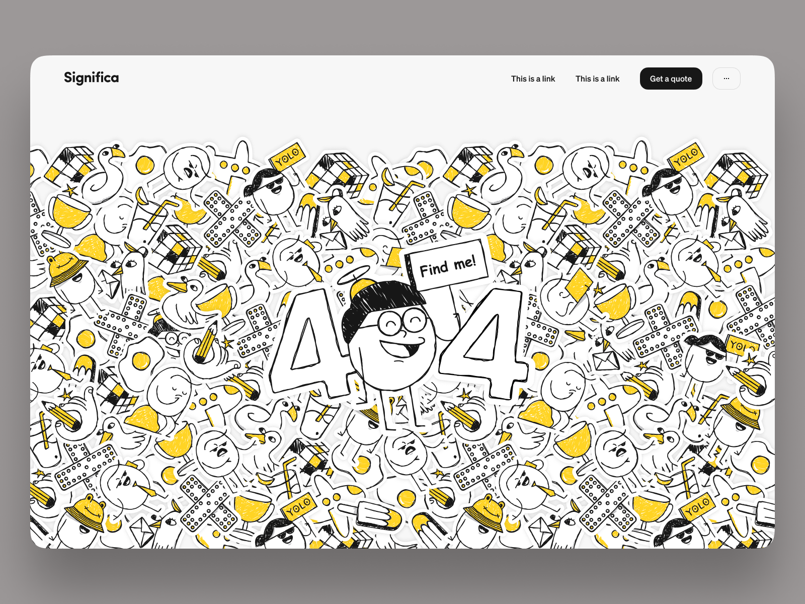
The 404.
Nothing expresses the feeling of landing on 404 pages like Find Waldo does. "Oh, where am I?". So we did our own similar game: Find Nobita.
The Services timeline.
There's nothing like the joyfulness of launching a product, website, or anything, really! We want people to relive that experience and be blasted with confetti. Everyone loves a good dose of confetti.
The Newton's cradle.
This one is actually deeper than plopping matter.js into the website simply because it makes things more interesting. Strategy and Development swing around if you try it, but the design is always constant. It doesn't move. That's just like us: every project we accept must contain the design element in it. It is the constant. Otherwise, we won't take it on board.
The Get a quote.
We were fed up of our old "Get a quote" form. Bland, the same as all the others. Lame. So, we wanted to give it a twist. Make it more exciting and responsive to the user's input. Working with us will be fun, and everything starts in that form. It begins in grand fashion.
The childish nature.
We are a bit childish in a good way. That's how we stay fresh and creative. Someone – we don't remember who – used to say that as a Design firm, as people get older, creativity and willingness to experiment gradually fade, so you must hire young people to keep it refreshed and alive. We guess we're childish to keep it going. This section is just it.
The tone and the egg puns.
Everything revolves around eggs. Our logo, our Seggs, the egg puns. There are just so many. Too many for some. It ties to our childish nature mentioned above. It is part of the brand now.

The brand and the stickers.
Speaking of the brand, this website forced us to set our brand in stone. We did a few experiments over the years but were a bit all over the place. Just look at our Instagram over the past 2 years, and you'll see great inconsistencies. The website launch forced us to focus and establish our brand – tone of voice, visuals, illustration style, sticker, the whole thing.

The thumbnail preview.
From experience and using Airbnb, we know that opening a project (or a house, in Airbnb's case) is quite a commitment. So, we followed Airbnb's example and implemented a thumbnail slider for those we needed convincing to dive in.
And a fun fact? It is the second-highest Click Rate on the entire website.

The team.
We love our team. They are the most important people in the company. Ah! They are the only people. You get the point. Anyway, we wanted to give them a dedicated page showing their contributions to Significa. We created a profile page for everyone, both current and past members.

Our history.
Our history is a mix of amazing projects and great times we had together. We wanted to create a timeline of our existence that isn't classic, formal, or dull, with things like "In 1969, Significa was officially incorporated", "In 1970, the business expanded due to great contracts with banks", "In 1971, Significa wins SME of the year". Who cares? It's too corporate for our taste. Enjoy us having our Cook-offs and our beers, our cherished moments and projects, our random things.
The OG Images.
When we say we take the extra mile and have a keen eye for detail, we are not BS'ing around. Our OG images were carefully thought about and designed, got specific copywriting, and some even have easter eggs in them. We got to the finest detail.

Open source code.
Some of the things we've done on this website are amazing and quite hard to achieve. We want everyone to be able to achieve the same. And if peaking into our code is a way to do so, go for it. We've made it all open-source in our Github.
Svelte & Tailwind.
We had never used either Svelte or Tailwind CSS before. We wanted to, but client projects aren't necessarily the best playground. So we took this internal one, low risk (kind of), to experiment with both. In the end, leaner, faster development compared to Next, a happy team with one more great tool in our kit, and a result we are all proud of.
Google Analytics Plausible.
And one last thing: we completely got rid of Google Analytics. As a company, we are all in favour of everyone's right to privacy! We don't need to know who you are at all. In Plausible's own words: "All the site measurement is carried out absolutely anonymously". Cookies are not used, and no personal data is collected. There are no persistent identifiers". We back this 100%.
In the end, it all came about on May 13th. Quite an esoteric date, if you ask us. We actually wrote an article about launching on this particular date.

We needed a miracle to launch our new website.
We launched a website and we wrote an article about it.
That's all for this one. We hope you enjoyed it.
What are you looking for?
Please choose an option below

